Northpoint
Website Re-Design
As a UI design mentee and intern, I was tasked by the Marketing and IT departments to modernize the company’s website, which had not been updated since 2019. I created a redesigned homepage concept to explore a more contemporary look and feel that could guide future improvements.
Timeline: 4 months
Year
2025
Client
Northpoint Commercial Finance
Tools Used:
Figma, Adobe Illustrator, Procreate


My Role
UI Designer (Intern)
The Problem - The company’s outdated 2019 website needed a modern, refreshed homepage to improve clarity
The company’s website had not been updated since 2019, resulting in an outdated visual style and user experience that no longer aligned with current design standards or the brand’s evolving identity. The Marketing and IT departments requested a modernized homepage concept to improve aesthetics, clarity, and overall usability. My task was to redesign the homepage to establish a refreshed, contemporary direction for future website updates.

Pain Points
To visualize the website’s pain points, I applied a weighted scoring method. This combines how frequently a pain point occurs with its severity, giving a more meaningful measure of impact. So the frequency is the number of people complaining about a problem, and the severity is on a scale of 1-5. The formula I used is:
Weighted Score = Frequency x Severity
I conducted usability testing with a group of target users to observe how they interacted with the website and identify areas of friction. This helped uncover recurring pain points that were affecting the overall user experience.
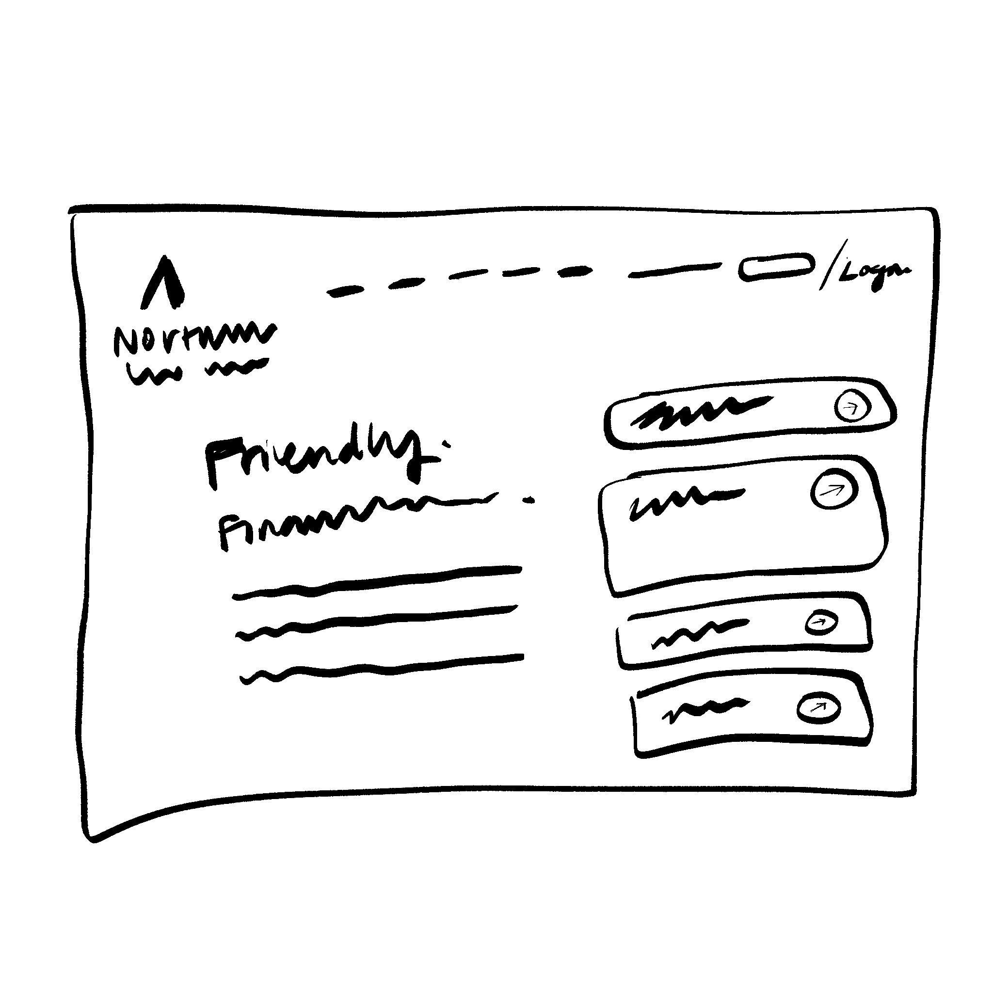
Wireframes
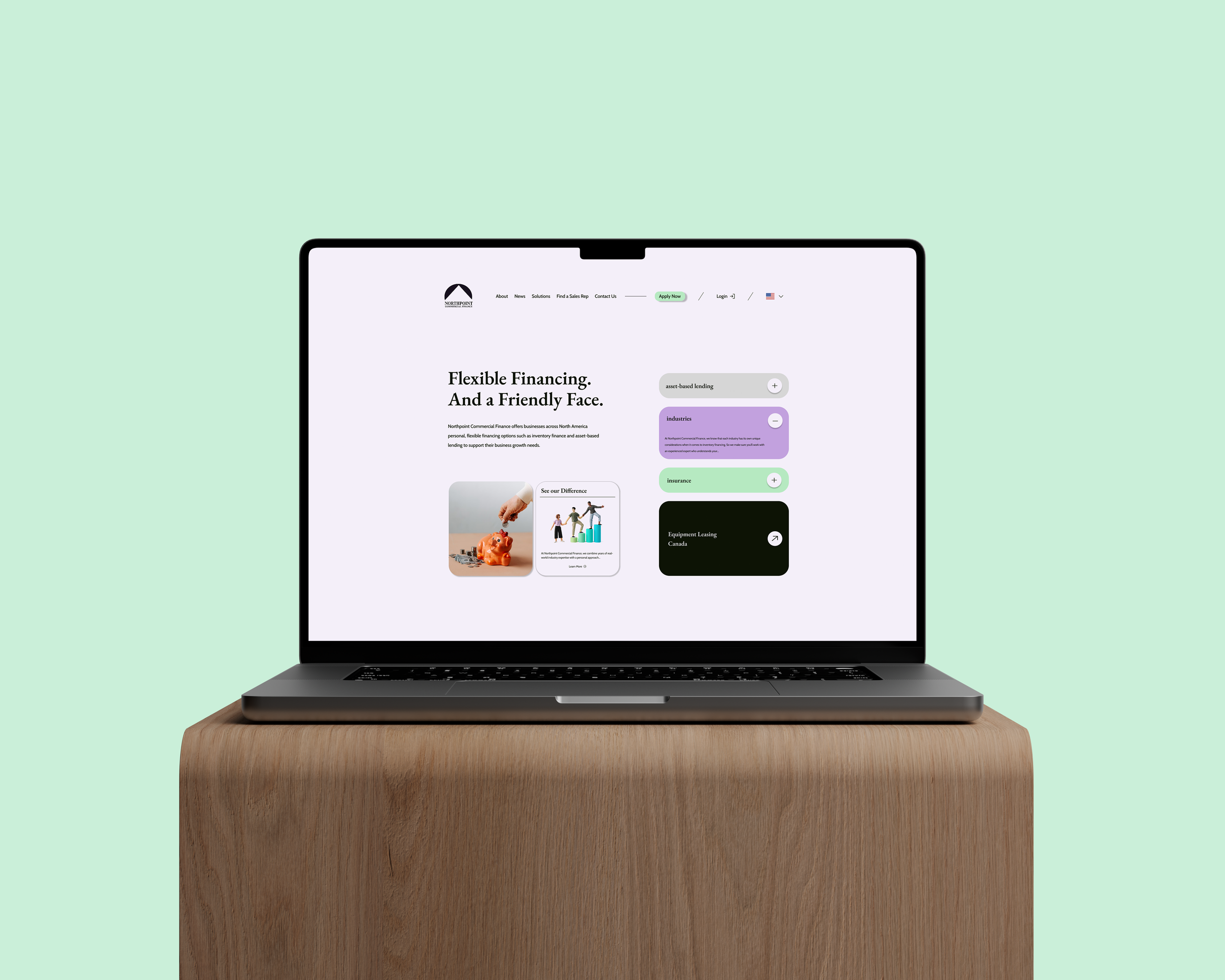
Because of the tight timeline, we focused on creating a rough draft of the new homepage only. I also updated the color scheme to make it feel more modern, since the original palette felt dull.

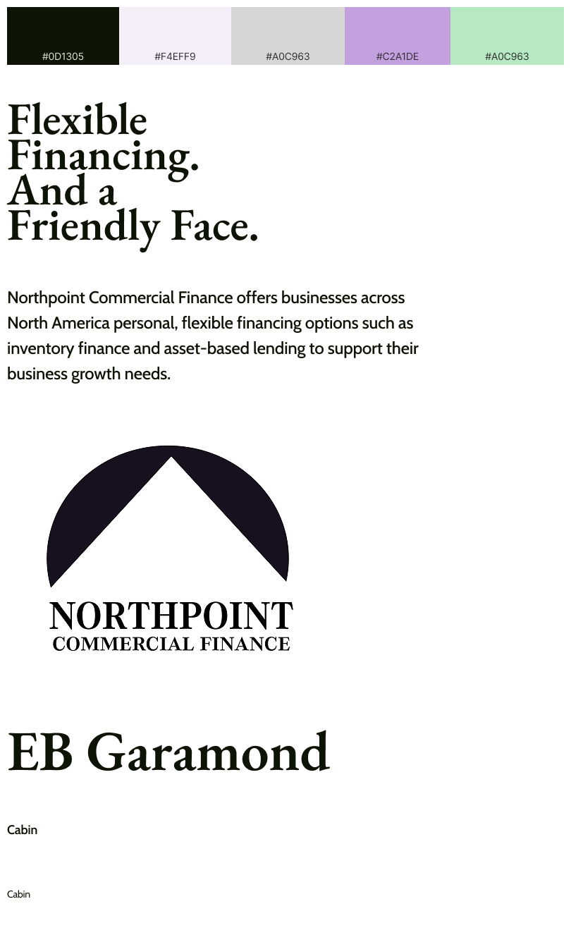
Re-Design & Components
I created a modern, easier-to-navigate mockup. I created a new color palette using the old one. Logo was re-created using Adobe Illustrator.
I replaced the large background video with graphics that the user can interact with, to keep the landing page engaging.
New UI Style
I focused on sticking to what the home page originally offered, because the client did not want to lose any links to access to information that was already there. To modernize however, I decided to use the original color palette of the site and its CTA buttons, to play around with the RGB settings and create this new color palette.
Fonts remain simple and easy to read. Logo remains the same, just recreated on Adobe Illustrator.
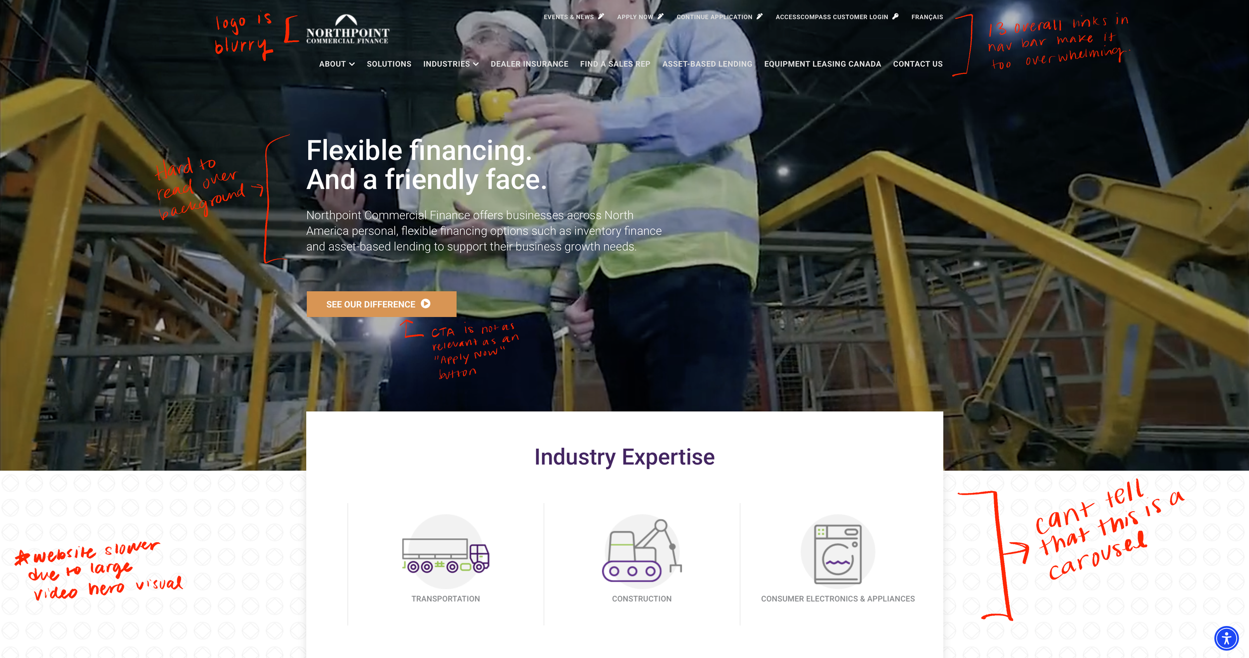
Website’s Original Design
I annotated on top of the original Northpoint website design to show the main areas that are struggling.